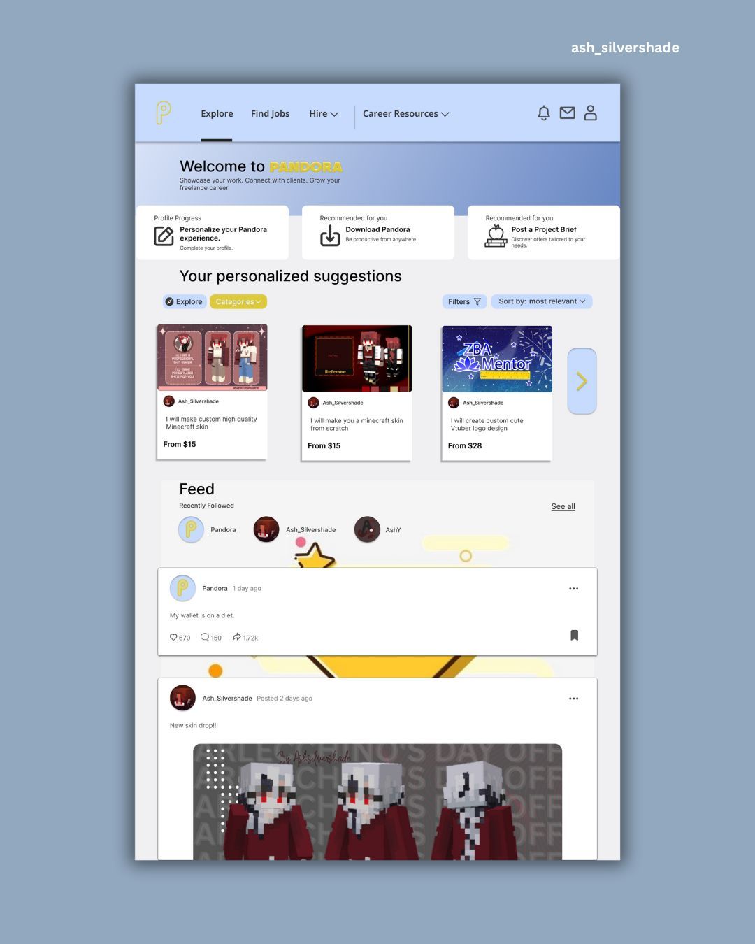
1. Cognitive Load — Don’t Make the Brain Work Overtime
People don’t open apps to solve a puzzle.
They want clarity. Speed. Simplicity.
If a screen has too much going on, the brain gets overwhelmed.
And an overwhelmed user is a gone user.
Good UX keeps things simple by:
Showing only what’s needed
Using clean layouts
Breaking things into small steps
Helping the user focus on one action at a time
Think of it as giving the brain a smooth ride instead of a mental obstacle course.
2. Visual Hierarchy — Guide the Eye, Guide the User
Humans scan before they read.
Our eyes jump to what feels important—big text, bold colors, clear buttons.
Great designers use this to lead users without saying a word.
You can guide attention by:
Making primary actions big and clear
Using color to highlight key elements
Grouping related items together
Keeping the layout predictable
Good hierarchy = instant clarity.
3. Gestalt Principles — How Our Brains Connect the Dots
Humans naturally look for patterns.
Even if you don’t tell them something is connected, their brain will decide on its own.
Some quick examples:
Items close together feel related
Similar shapes feel like part of a group
The eye follows smooth lines
The brain fills in missing gaps
When you understand these instincts, your interfaces feel “right” without users knowing why.

My UI/UX Design Pandora
4. Emotion & Trust — Make People Feel Safe
Users don’t just use your design—they feel it.
A friendly interface earns trust before a single word is read.
Emotionally smart UX includes:
Clear feedback (“Done!” “Success!” “Let’s fix this together.”)
Soft animations
Honest messages
Clean, consistent visuals
When a product feels safe and friendly, people stay longer and explore more.
5. Familiarity — Don’t Make People Relearn What They Already Know
Ever noticed how almost every app has the same basic patterns?
Search = magnifying glass
Menu = three lines
Delete = trash can
It’s not laziness. It’s psychology.
The brain loves familiar things, they reduce thinking.
Good UX respects this and doesn’t reinvent the wheel unnecessarily.
6. Motivation — Nudge People Forward
Humans love progress. Even tiny wins feel good.
UX uses this by adding:
Progress bars
Steps indicators
Checkmarks
Confetti moments (yes, they work 😄)
It’s like the interface is cheering the user on.

My UI/UX design, Rozenta VPN – Advanced VPN UI for Modern Users.
👁️ 7. Attention — You Only Have a Few Seconds
People decide fast.
Like, really fast.
If the interface is messy or confusing, they mentally check out.
Capture attention by:
Keeping it clean
Making CTAs obvious
Using animations wisely
Removing distractions
Focus is precious—protect it.
🔢 8. Choice Overload — More Options, More Confusion
Ever walked into a shop with too many choices and walked right back out?
That’s Hick’s Law in action.
Too many options = stress
Fewer options = clarity
Good UX reduces choices, highlights the right path, and keeps the user confident.
🌟 Final Thoughts
The best UX designers don’t just design, they…
They ask:
“How does the user think?”
“What makes them feel stuck?”
“What makes them smile?”
When you design with the human mind in mind, everything becomes easier, smoother, and more joyful, for everyone.
Good UX = good psychology.
And once you understand that, you start designing differently forever.