1. Clarity Comes First
If users can’t figure out what to do in the first few seconds, they’ll leave. Every button, icon, and label should be clear and self-explanatory.
👉 Tip: Keep language simple, avoid jargon, and use familiar icons.

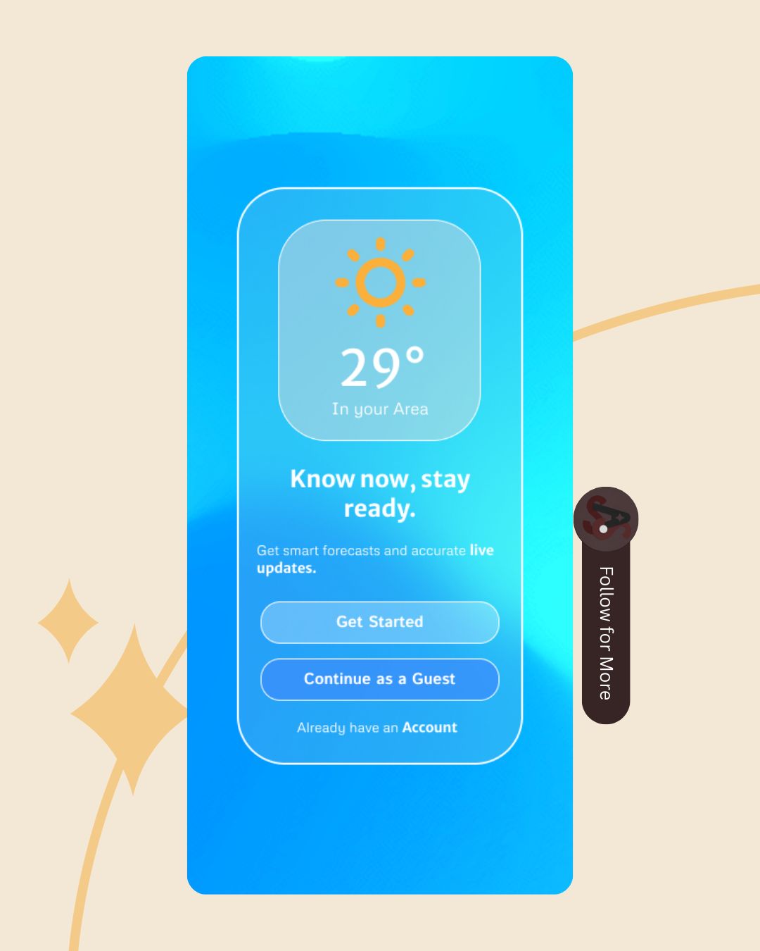
My Weather App UI Design
2. Consistency Is Key
Consistency builds trust. Users shouldn’t feel like they’re learning a new system on every page.
👉 Tip: Stick to a design system—consistent colors, typography, and button styles throughout your product.
3. Visual Hierarchy Matters
Guide users’ attention by emphasizing what’s most important. Bigger, bolder, or brighter elements naturally stand out first.
👉 Tip: Use size, color, and spacing to highlight primary actions (like “Sign Up” or “Buy Now”).

My Weather App Startup Screen UI design
4. Keep It Simple (KISS Principle)
The simpler the design, the easier it is to use. Don’t overload screens with too much text, too many options, or unnecessary visuals.
👉 Tip: Focus on core tasks. If it doesn’t serve the user, cut it.
5. Provide Feedback
Users should always know what’s happening after they take an action. Feedback makes an interface feel alive and responsive.
👉 Tip: Use animations, success messages, or progress bars to confirm actions like “form submitted” or “file uploaded.”
6. Accessibility for All
Inclusive design is no longer optional. Your product should be usable by people with different abilities.
👉 Tip: Ensure good color contrast, provide alt text, support keyboard navigation, and design with screen readers in mind.
7. Affordance & Intuitiveness
Users should immediately recognize how an element works. A button should look clickable; a slider should look draggable.
👉 Tip: Design elements to “look like what they do.” For example, raised buttons invite pressing.
8. Prioritize Speed & Performance
A beautiful UI means nothing if it’s slow. Users expect fast loading and smooth interactions.
👉 Tip: Optimize images, use efficient animations, and design for performance across devices.
9. Design for Different Devices (Responsive UI)
Your design should look and work great on all screen sizes—from desktops to smartphones.
👉 Tip: Use fluid grids, flexible images, and breakpoints to create adaptive layouts.
10. Test, Iterate, Improve
No design is perfect on the first try. Testing reveals what works—and what doesn’t.
👉 Tip: Run usability tests, collect feedback, and keep refining your UI based on real user behavior.
💡 Final Thoughts
Great UI design blends beauty with functionality. By following these 10 principles—clarity, consistency, simplicity, accessibility, and more—you’ll create digital experiences that users actually enjoy.
Remember: UI isn’t just about looking good. It’s about helping people achieve their goals easily and happily.
Stay curious, keep testing, and never stop improving—because great design is always a work in progress.